
Veritas Wave, an innovative e-commerce platform, sought a unique logo that would encapsulate its core values and resonate with its audience. The company’s name combines “Veritas,” symbolizing truth and trust, with “Wave,” representing dynamic movement and growth. Our mission was to create a logo that seamlessly integrated these elements, providing Veritas Wave with a powerful and versatile brand identity.
Our design process began with comprehensive research and discovery. We engaged with the Veritas Wave team to understand their vision, mission, and target audience. We also analyzed market trends and competitor logos to identify opportunities for differentiation.
Based on our research, we brainstormed several design concepts. The goal was to blend symbols of trust and dynamic movement. We explored different visual elements, including shields, waves, and abstract symbols.
We developed three primary concepts:
After reviewing these concepts with the Veritas Wave team, we proceeded with refining the third concept—the Integrated Symbol.
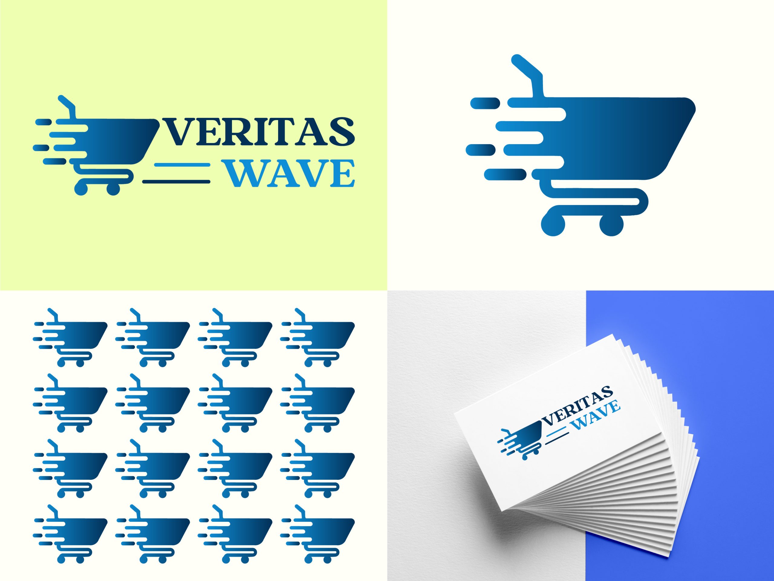
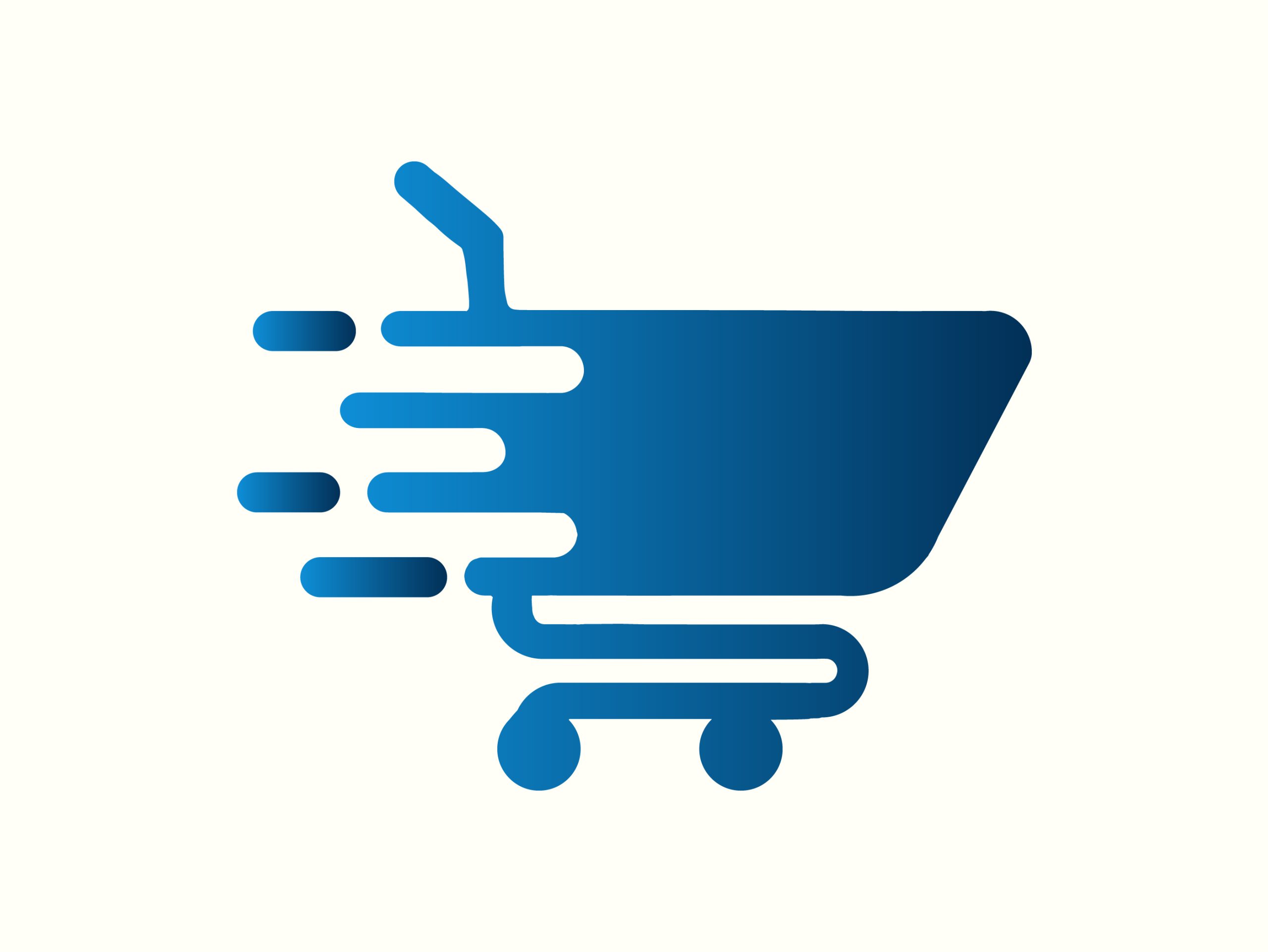
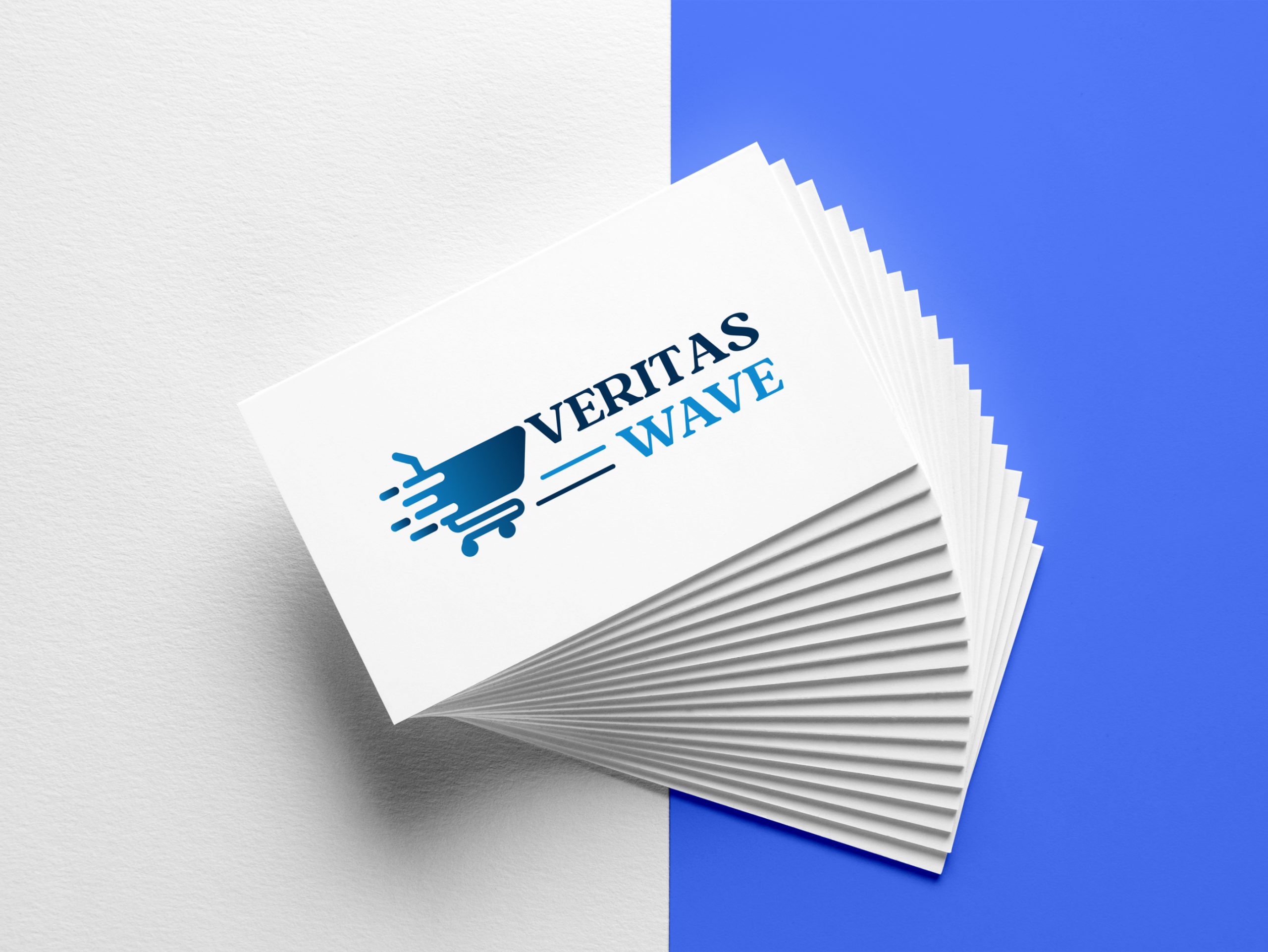
The final design featured a dynamic shopping cart icon, symbolizing both trust and movement. We carefully balanced the checkmark and wave elements within the cart, ensuring clarity and impact. The color palette of deep blue and vibrant teal was chosen to convey reliability and modernity.
We created multiple logo variations to ensure versatility across different applications, including website headers, social media profiles, and business cards. The final logo package included horizontal, vertical, and icon versions, along with comprehensive brand guidelines.
The Veritas Wave logo was successfully launched, receiving positive feedback from both the client and their customer base. The logo significantly enhanced brand recognition and trust, helping Veritas Wave establish a strong presence in the competitive e-commerce market. The adaptable design seamlessly integrated across various marketing materials, contributing to a cohesive and professional brand image.
The Veritas Wave logo design project highlights our expertise in translating a brand’s core values into a compelling visual identity. By combining strategic thinking with creative execution, we delivered a logo that stands out in the e-commerce industry and supports Veritas Wave’s mission of providing a trustworthy and dynamic online shopping experience.
This case study exemplifies our commitment to excellence in graphic design and our ability to create impactful visual identities that drive business success. If you’re looking to elevate your brand with a distinctive logo, our team is ready to bring your vision to life.
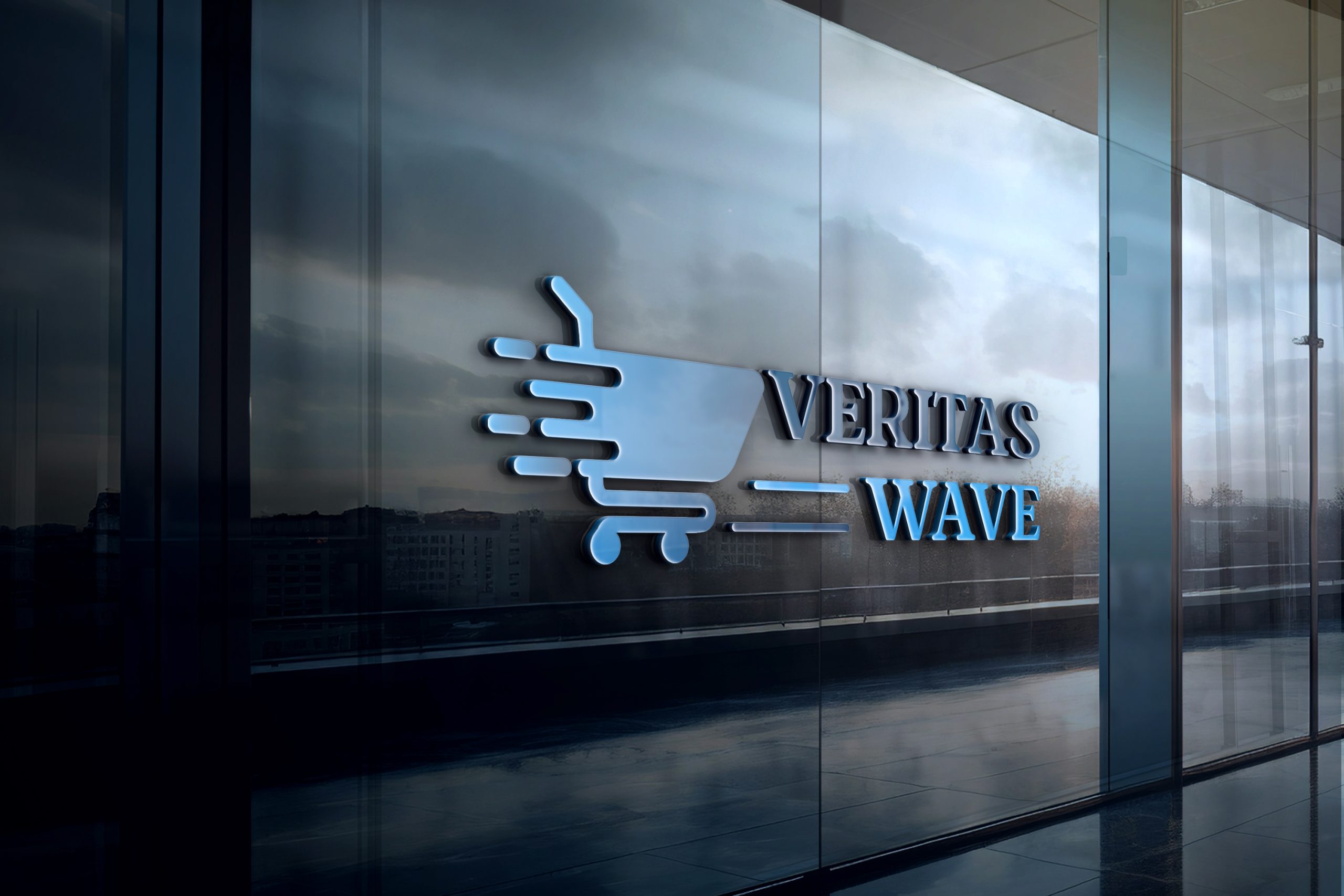
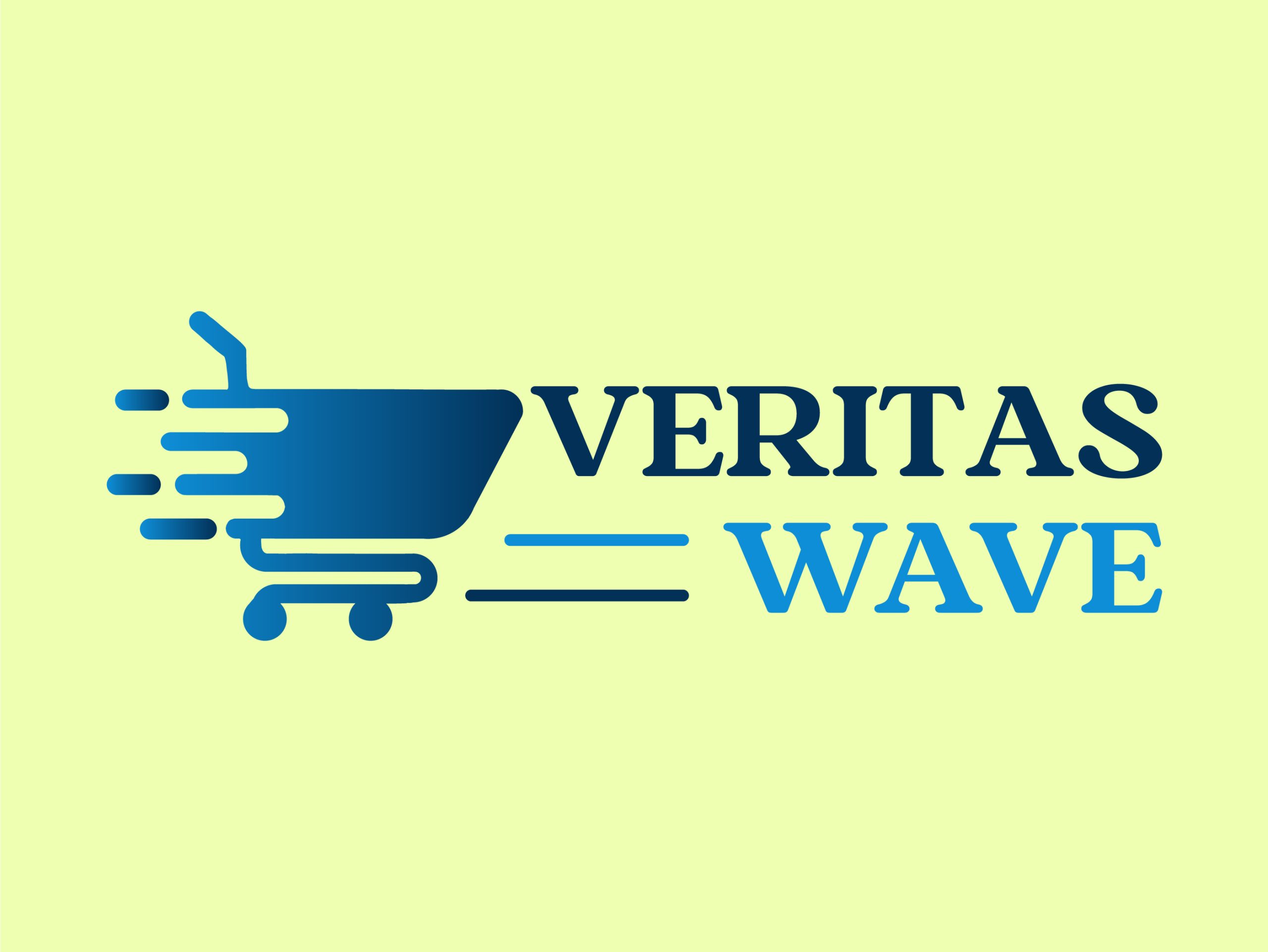
Here is the final logo design for Veritas Wave:
Based out of Chicago, we are a global no code design agency that finds its foundation built on building customer experiences that nurture our client’s success.
Get In TouchIf Our Customer Has any Problem and any Query we are always happy to help them.
Experience refers to the conscious events in ral, more specifically to perceptions.
A creative team is made up of several key members, starting with a creative director.
It's a matter of something being singular or plural. Example: If a car lot is focusing an