Journey Joy Pro, a comprehensive booking platform, approached us with a need for a cohesive brand identity and a robust web application. As a multi-booking system offering hotel, tour, car, and event bookings, along with a shop system, Journey Joy Pro required a logo that captured its diverse services and a seamless web application to enhance user experience. Our mission was to create a visual identity and a web application that would resonate with their target audience and facilitate easy bookings.
Our process began with in-depth discovery and research. We engaged with the Journey Joy Pro team to understand their vision, mission, and the diverse services they offered. We also analyzed their target audience and competitors to identify opportunities for differentiation and innovation.
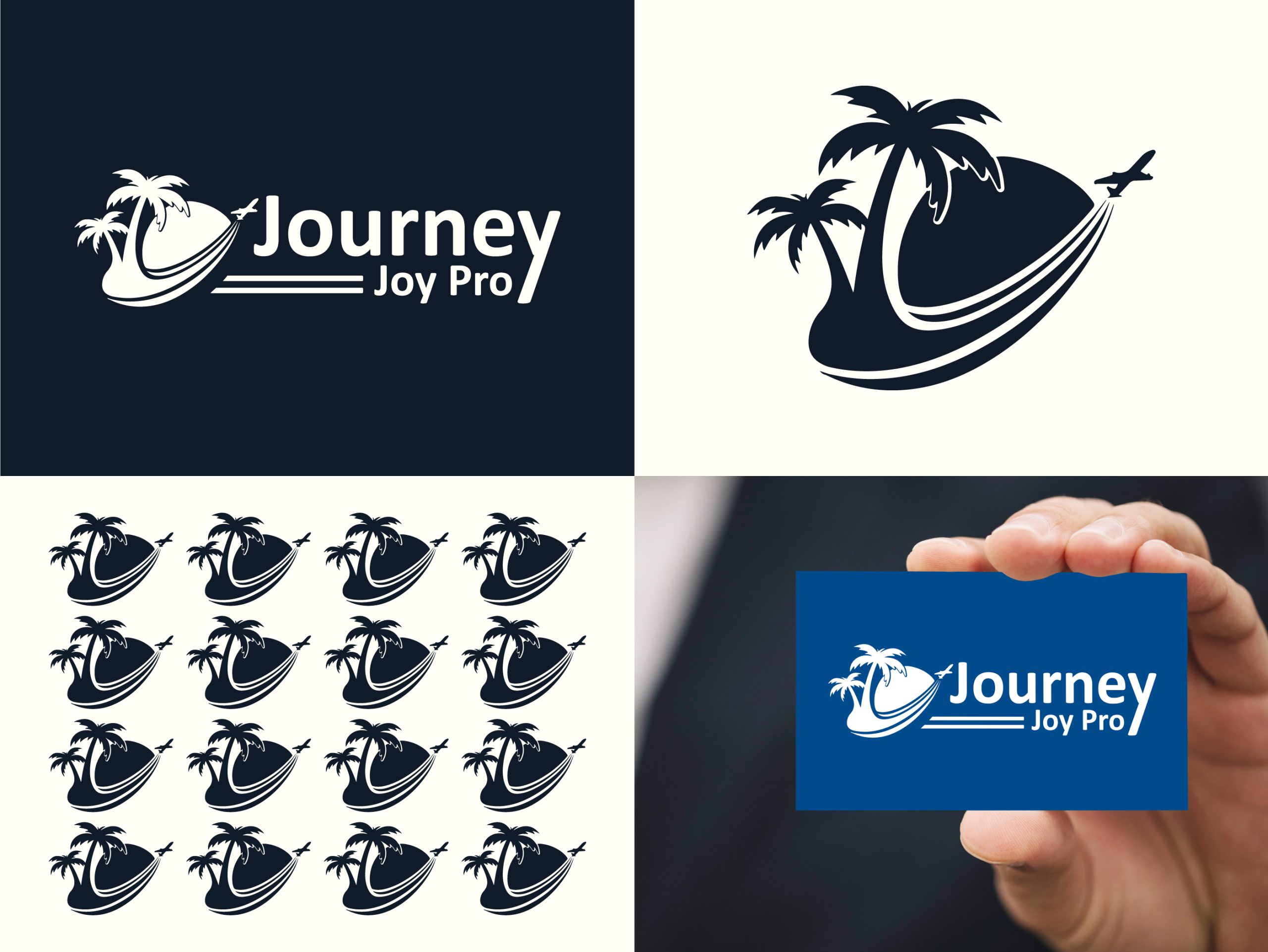
Based on our research, we brainstormed several design concepts for the logo. The goal was to blend symbols of travel, adventure, and diversity. We explored various visual elements, including globes, maps, and abstract travel icons.
We developed three primary concepts:
After presenting these concepts to the Journey Joy Pro team and gathering their feedback, we proceeded with refining the third concept—the Integrated Icons.
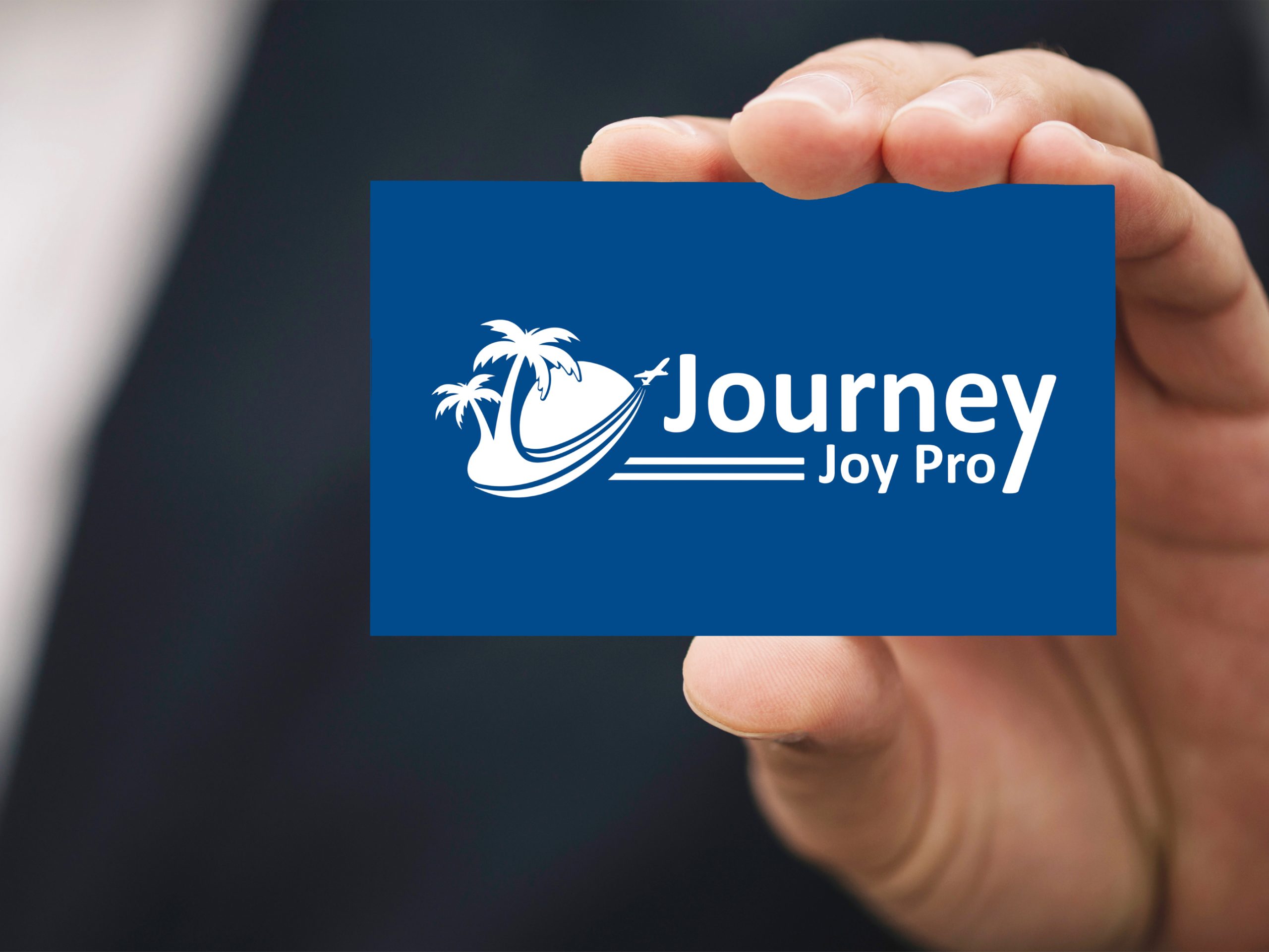
The chosen logo design featured various travel-related icons seamlessly integrated into a cohesive and modern design. We experimented with different color palettes, eventually selecting a combination of vibrant blue and green. The blue conveyed trust and reliability, while the green added a touch of freshness and adventure.
The final logo design consisted of:
With the logo finalized, we moved on to developing the web application. The application needed to be user-friendly, visually appealing, and efficient in managing multiple booking services.
We focused on creating a seamless user experience with features such as:
Rigorous testing was conducted to ensure functionality, performance, and usability across all features. The web application was successfully launched, providing a seamless and engaging user experience.
The Journey Joy Pro logo and web application were launched with significant success. The logo received positive feedback for its modern and cohesive design, enhancing brand recognition. The web application provided a seamless and efficient booking experience, helping Journey Joy Pro attract and retain users across its diverse services.
The Journey Joy Pro project showcases our ability to create a cohesive brand identity and a robust web application that enhances user experience. By combining strategic thinking with creative execution, we delivered a logo and application that stand out in the travel and booking industry and support Journey Joy Pro’s mission of providing diverse and convenient booking services.
This case study exemplifies our commitment to excellence in graphic and web design, and our ability to create impactful visual identities and applications that drive business success. If you’re looking to elevate your brand with a distinctive logo and web application, our team is ready to bring your vision to life.


Based out of Chicago, we are a global no code design agency that finds its foundation built on building customer experiences that nurture our client’s success.
Get In TouchIf Our Customer Has any Problem and any Query we are always happy to help them.
Experience refers to the conscious events in ral, more specifically to perceptions.
A creative team is made up of several key members, starting with a creative director.
It's a matter of something being singular or plural. Example: If a car lot is focusing an
We always stay with our clients and respect their business. We deliver 100% and provide instant response.