Mijnbadkamer Spiegel, a niche Shopify e-commerce platform specializing in bathroom mirrors, approached us to create a distinctive and elegant logo. As a brand focused on offering high-quality and stylish bathroom mirrors, Mijnbadkamer Spiegel needed a logo that would reflect its commitment to quality, style, and sophistication. Our mission was to develop a visual identity that would resonate with their target audience and enhance their brand presence in the competitive e-commerce market.
Our design process began with an in-depth discovery phase. We engaged with the Mijnbadkamer Spiegel team to understand their vision, mission, and the aesthetic they aimed to convey. We also analyzed their target audience and competitors to identify opportunities for differentiation and innovation.
Based on our research, we brainstormed several design concepts. The goal was to blend symbols of elegance, reflection, and modern design. We explored various visual elements, including mirrors, abstract shapes, and sophisticated typography.
We developed three primary concepts:
After presenting these concepts to the Mijnbadkamer Spiegel team and gathering their feedback, we proceeded with refining the first concept—the Mirror and Reflection.
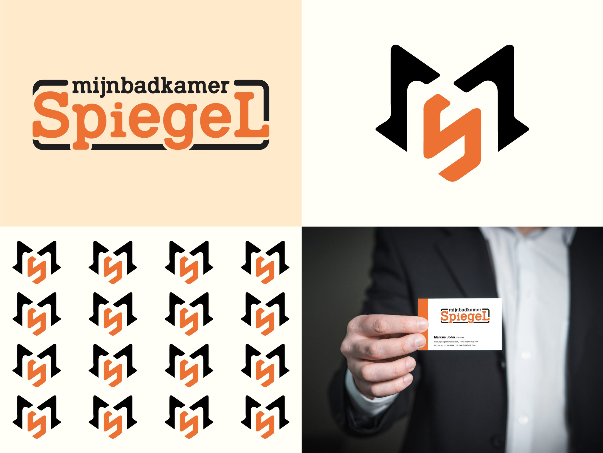
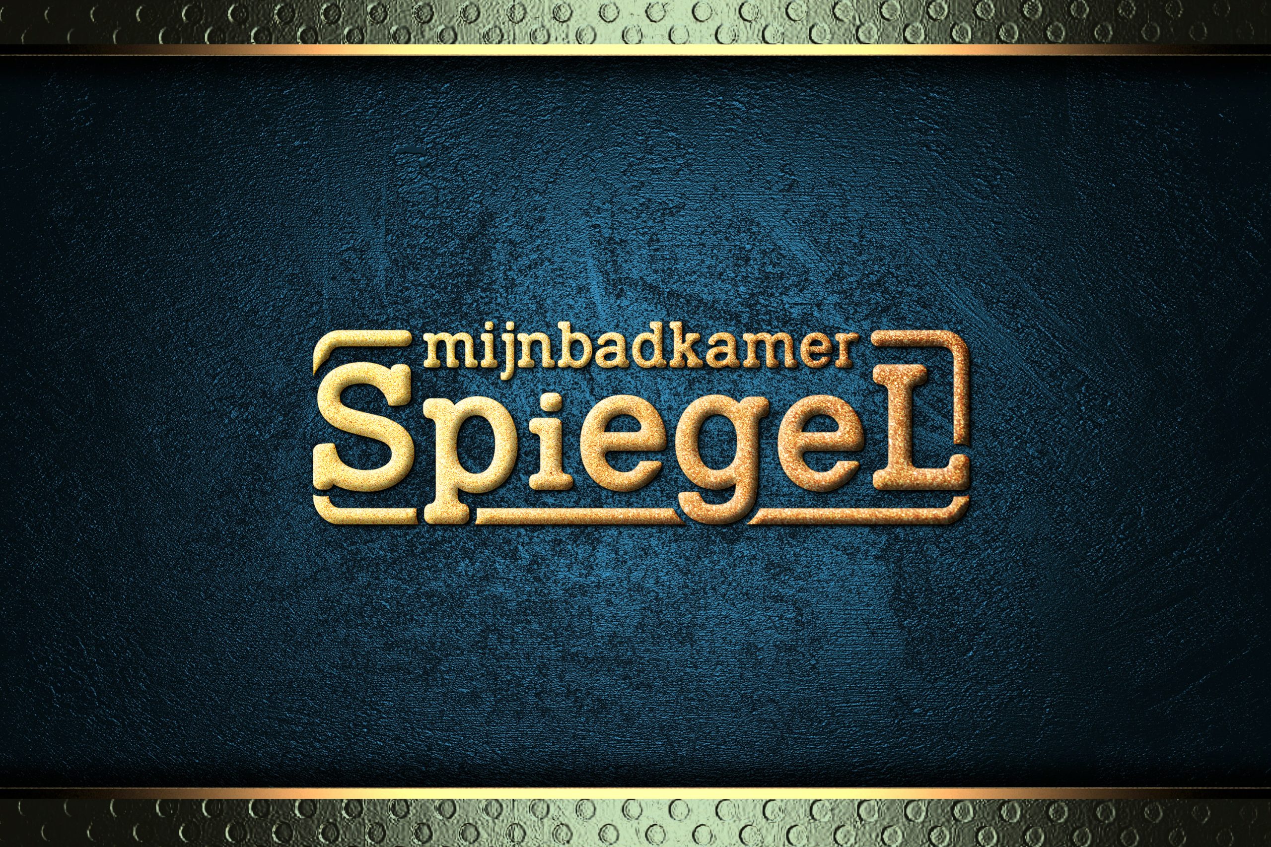
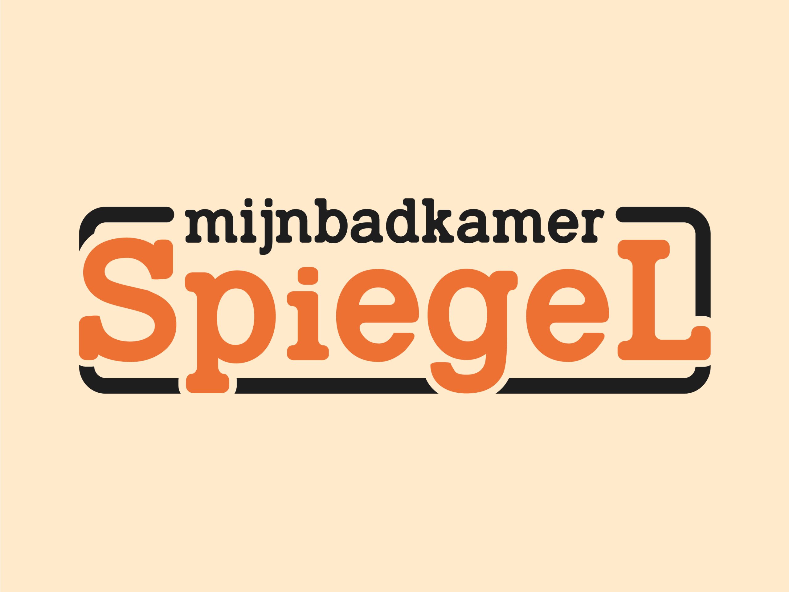
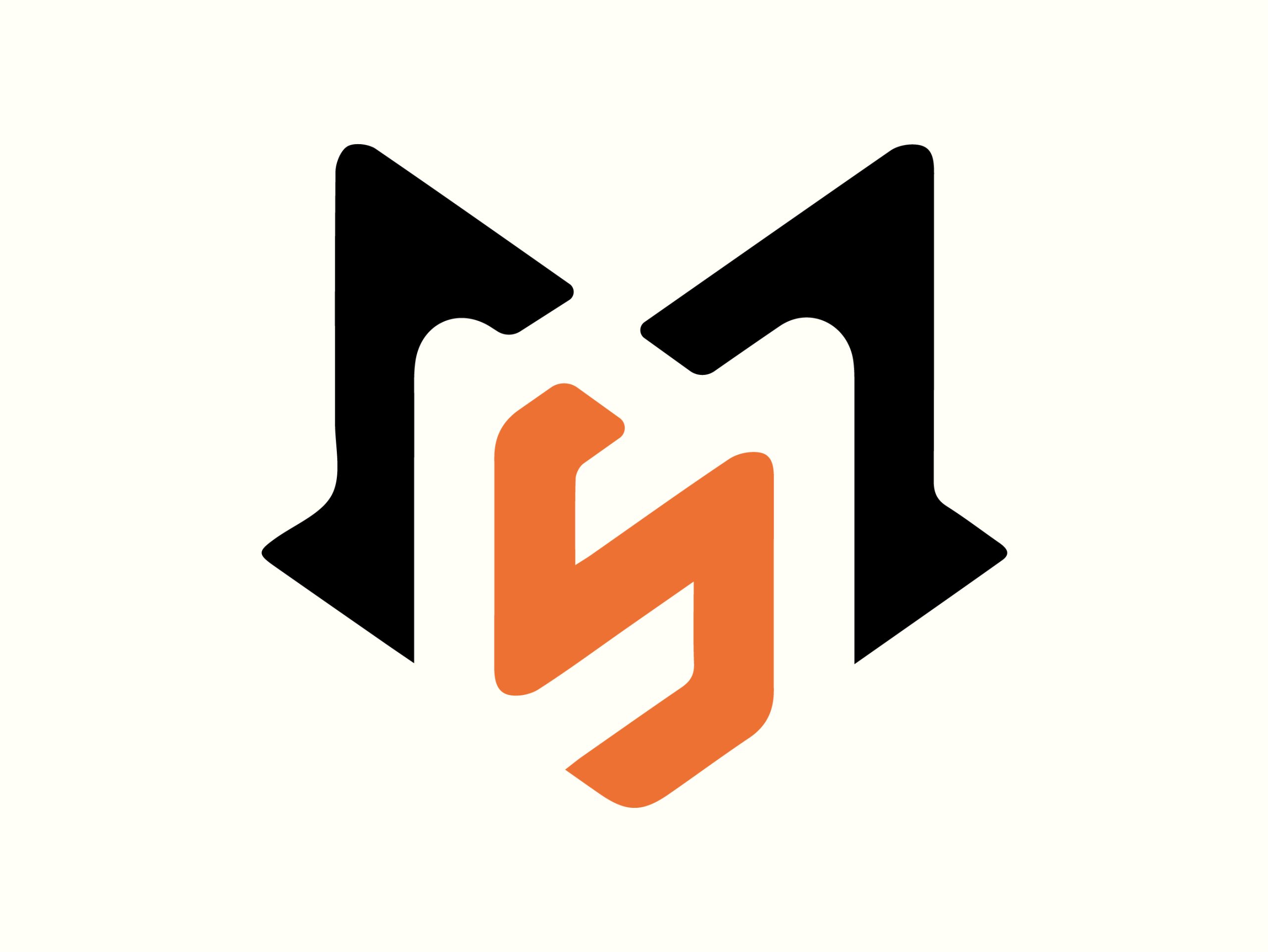
The chosen logo design featured a stylized mirror with elegant reflections, combined with clean and sophisticated typography. We experimented with different color palettes, eventually selecting a combination of deep blue and silver. The deep blue conveyed trust and quality, while the silver added a touch of elegance and modernity.
The final logo design consisted of:
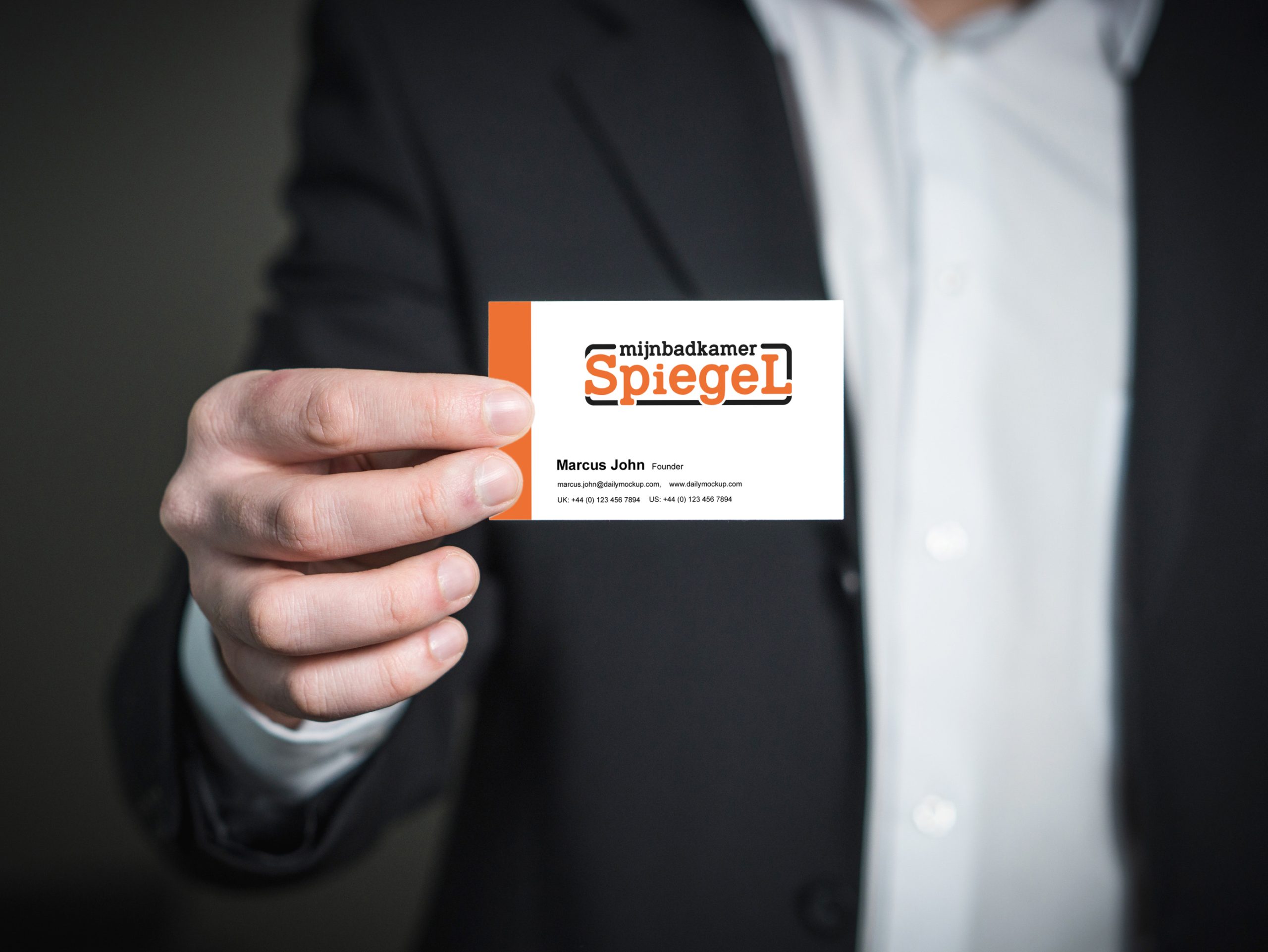
We ensured the final logo was adaptable across various applications, from the Shopify website header and social media profiles to product packaging and promotional materials. This involved creating multiple versions of the logo, including horizontal, vertical, and icon variations, along with detailed brand guidelines.
The Mijnbadkamer Spiegel logo was launched with significant success. It received positive feedback from both the client and their customer base, enhancing brand recognition and trust. The logo’s versatility allowed it to seamlessly integrate across all marketing and promotional materials, contributing to a cohesive and impactful brand image.
The Mijnbadkamer Spiegel logo design project highlights our ability to translate a brand’s core values into a compelling visual identity. By combining strategic thinking with creative execution, we delivered a logo that not only stands out in the e-commerce market but also supports Mijnbadkamer Spiegel’s mission of offering high-quality and stylish bathroom mirrors.
This case study exemplifies our commitment to excellence in graphic design and our ability to create impactful visual identities that drive business success. If you’re looking to elevate your brand with a distinctive logo, our team is ready to bring your vision to life.

Based out of Chicago, we are a global no code design agency that finds its foundation built on building customer experiences that nurture our client’s success.
Get In TouchIf Our Customer Has any Problem and any Query we are always happy to help them.
Experience refers to the conscious events in ral, more specifically to perceptions.
A creative team is made up of several key members, starting with a creative director.
It's a matter of something being singular or plural. Example: If a car lot is focusing an
We always stay with our clients and respect their business. We deliver 100% and provide instant response.