Red Love, a dedicated blood donation platform, approached us with the need for a distinctive and meaningful logo. As a website committed to connecting blood donors with recipients, Red Love needed a logo that would encapsulate the essence of compassion, life-saving efforts, and community support. Our mission was to create a visual identity that would resonate with both donors and recipients, fostering trust and engagement.
Our design process began with an in-depth discovery phase. We engaged with the Red Love team to understand their vision, mission, and the emotional message they wanted to convey. We also analyzed their target audience and the unique aspects of the blood donation sector to identify opportunities for a distinctive visual identity.
Based on our research, we brainstormed several design concepts. The goal was to blend symbols of love, compassion, and the life-saving aspect of blood donation. We explored various visual elements, including hearts, blood drops, and hands.
We developed three primary concepts:
After presenting these concepts to the Red Love team and gathering their feedback, we proceeded with refining the second concept—the Helping Hands.
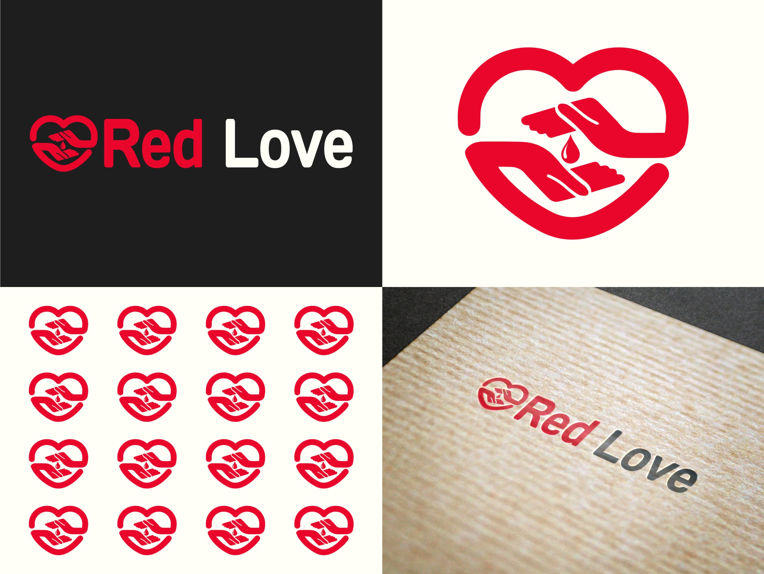
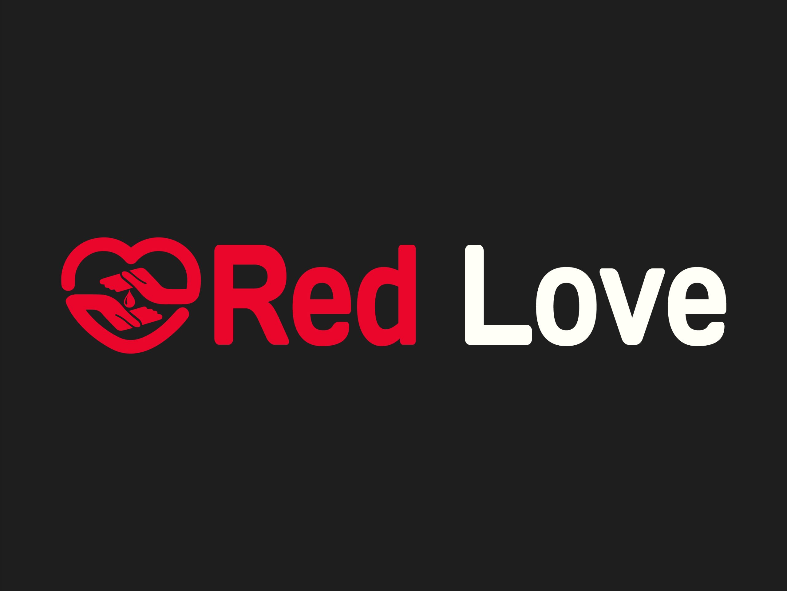
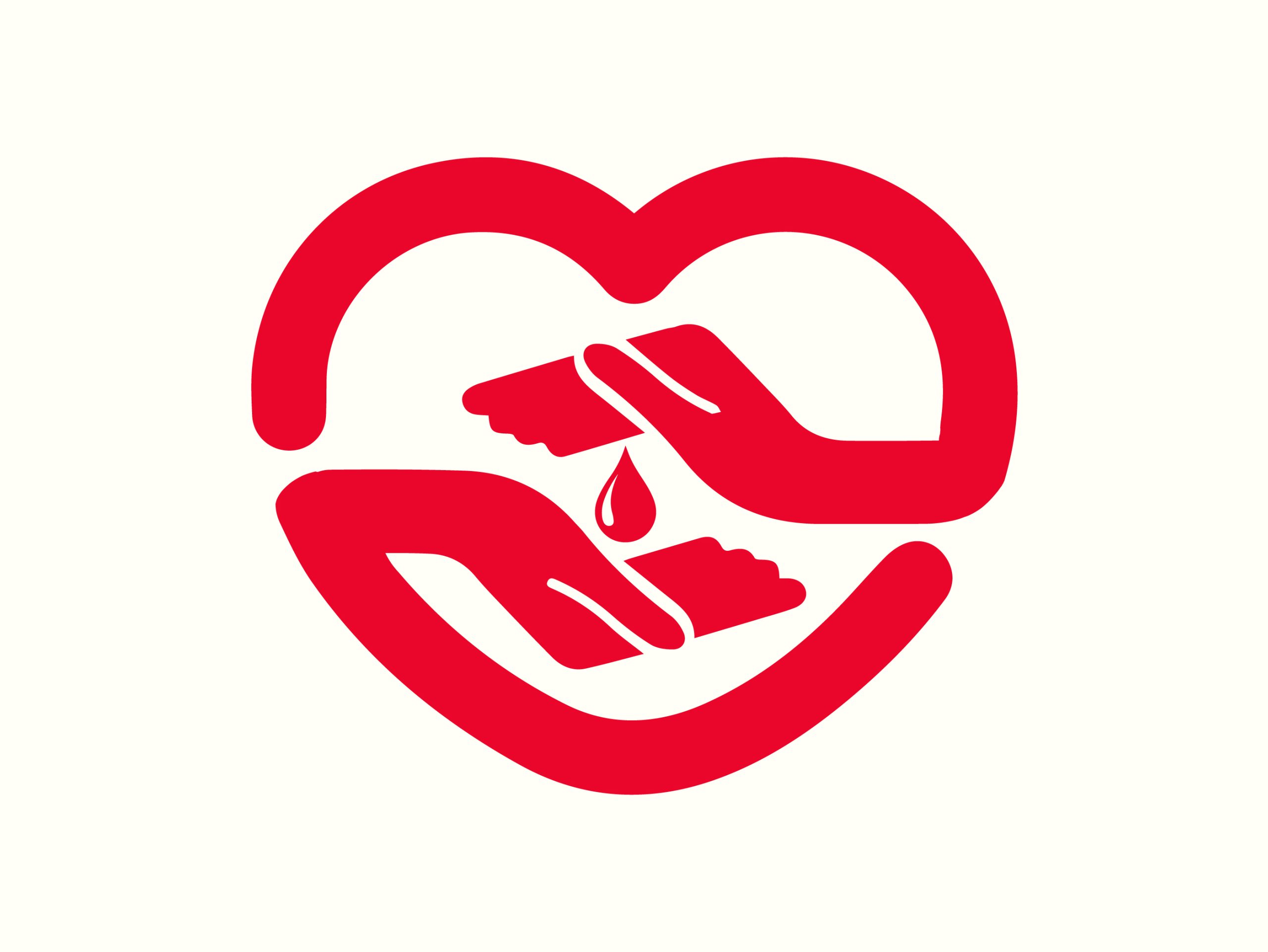
The chosen logo design featured a heart seamlessly integrated with two hands and a blood drop, symbolizing both love and the act of giving blood. We experimented with different color palettes, eventually selecting a combination of red and white. The red color conveyed urgency, compassion, and vitality, while the white added a sense of purity and hope.
The final logo design consisted of:
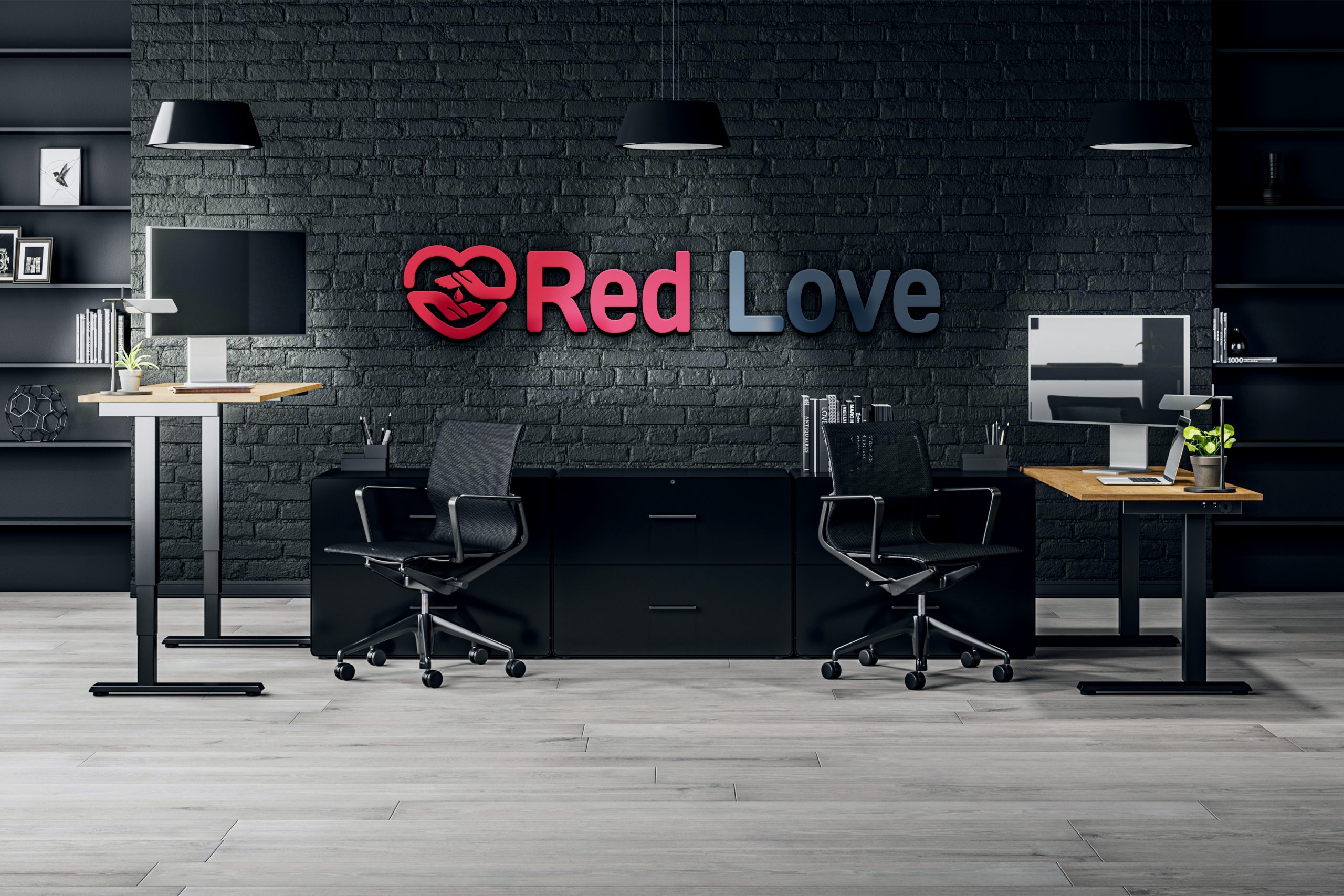
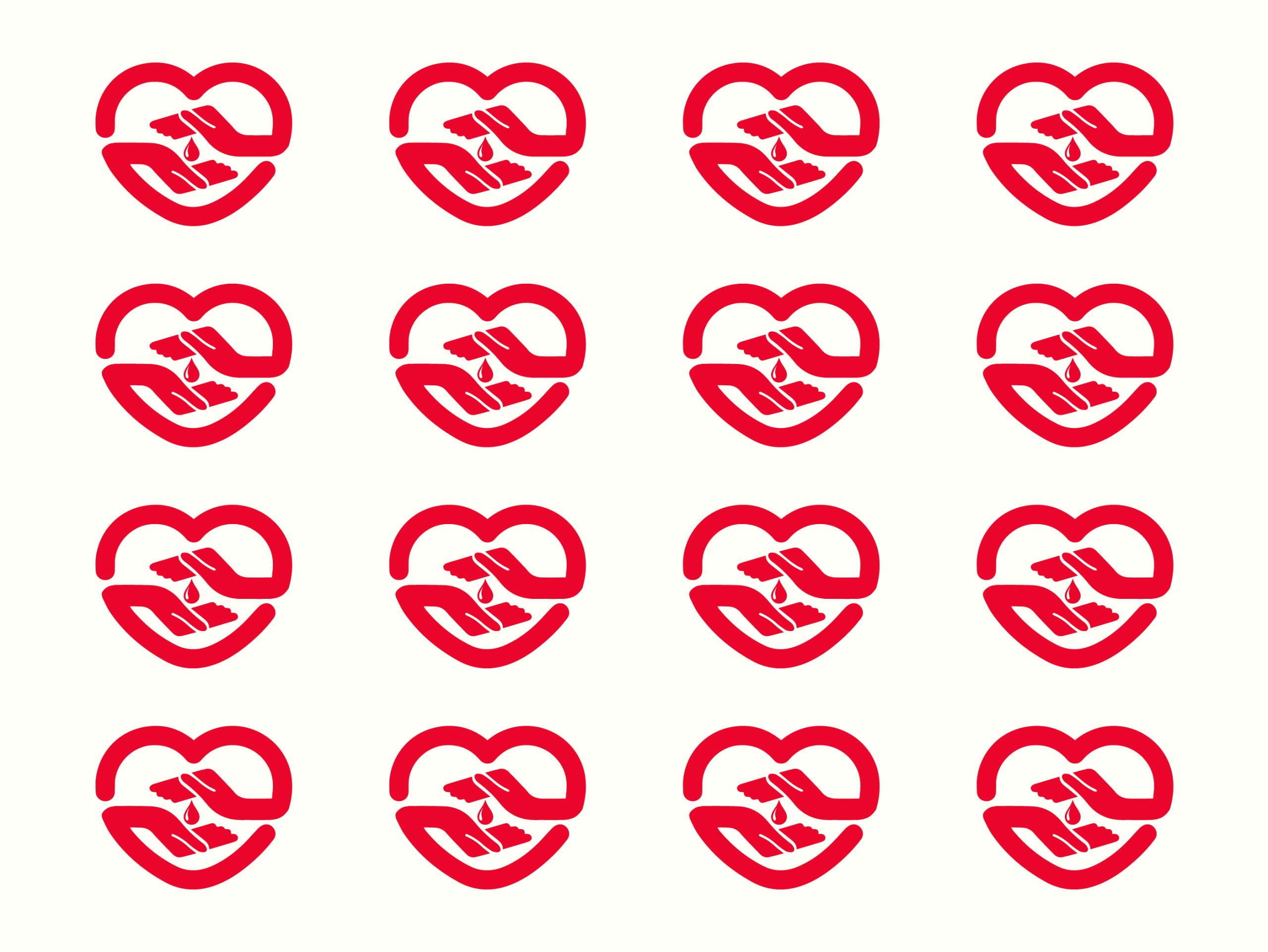
We ensured the final logo was adaptable across various applications, from website headers and social media profiles to donation materials and promotional items. This involved creating multiple versions of the logo, including horizontal, vertical, and icon variations, along with detailed brand guidelines.
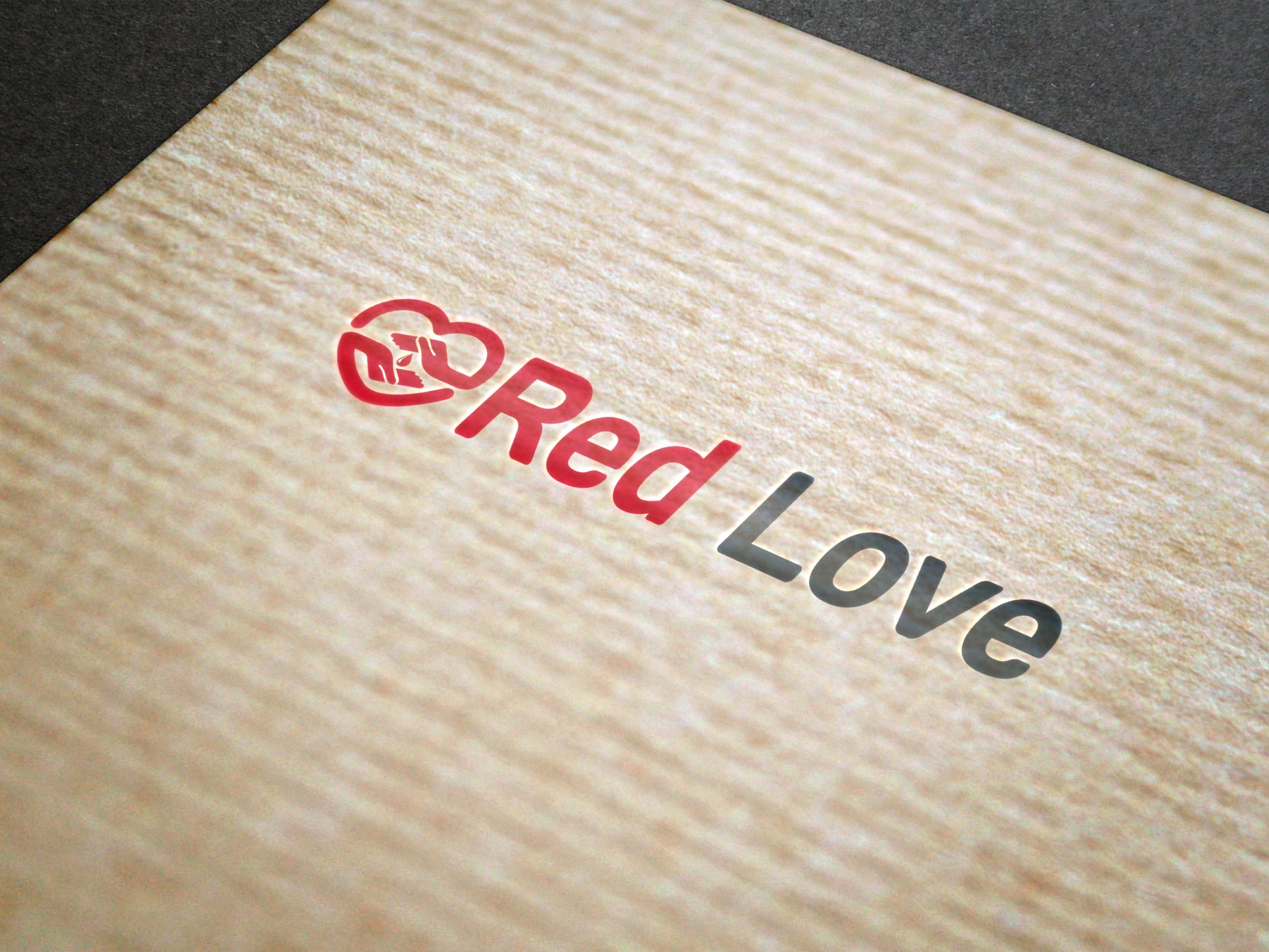
The Red Love logo was launched with significant success. It received positive feedback from both the client and their user base, enhancing brand recognition and trust. The logo’s versatility allowed it to seamlessly integrate across all marketing and promotional materials, contributing to a cohesive and impactful brand image.
The Red Love logo design project highlights our ability to translate a brand’s core values into a compelling visual identity. By combining strategic thinking with creative execution, we delivered a logo that not only stands out in the blood donation sector but also supports Red Love’s mission of fostering a community of life-saving donors.
This case study exemplifies our commitment to excellence in graphic design and our ability to create impactful visual identities that drive engagement and trust. If you’re looking to elevate your brand with a distinctive logo, our team is ready to bring your vision to life.
Based out of Chicago, we are a global no code design agency that finds its foundation built on building customer experiences that nurture our client’s success.
Get In TouchIf Our Customer Has any Problem and any Query we are always happy to help them.
Experience refers to the conscious events in ral, more specifically to perceptions.
A creative team is made up of several key members, starting with a creative director.
It's a matter of something being singular or plural. Example: If a car lot is focusing an
We always stay with our clients and respect their business. We deliver 100% and provide instant response.